Hands up – I have never given much thought to the accessibility of my writing – there, I’ve said it. I recall at the outset of my PhD studies, wrestling with choosing a font I like for my module assignment papers. I didn’t want to use the default fonts, preferring something that looked nice that wasn’t Times New Roman. I landed on Palatino and for the next two years submitted my assignments in this font, blissfully unaware of Serif and Sans Serif font styles, with no idea as to what was meant by ‘Serif’. I did recall however, that ‘Sans’ is the French language word for without, but thought no more of it until…
Fast forward two years later it was time to start thinking about the thesis. We were helpfully provided with a Word template whose body text was written in Arial 12. However, for me, as with Times New Roman, I thought this a little boring. All was not lost since the guidance also said “A particular font is not specified and you can change the font in this template.” Great, I thought, but then took note of the next sentence that set me thinking…
Some fonts are more dyslexia friendly e.g. Arial (A Sans Serif font). Arial, Verdana and Helvetica are often used in the design of web sites as they work well on screen.
PhD Thesis Template Doctoral Programme Students, February 2021
Hmmm. Well, I was familiar with adding Alt text to images associated with my occasional tweets. I knew of the work of AHEAD in Ireland and the UDL digital badge for Universal Design in Teaching & Learning is on my list for #whenIgetmyphd. In the meantime I felt unskilled to design my manuscript to be accessible, and admit that I did not really know what an accessible manuscript actually meant, other than a screen reader being able to read it aloud clearly to a user.
Outside of my academic pursuits I have been an avid reader since the age of seven when my mum helped me select three paperbacks from the annual church bazaar. I still have them, Heidi, The Railway Children and Little Women. In more recent years I have enjoyed listening to audio books from my public library, from autobiographies to thrillers. Such books give my eyes a rest and my imagination a break, doing the work for me. I have introduced older family members and friends to audio books with varying degrees of success. Falling asleep at night without setting the audio to stop at the end of the current chapter or after a certian period of time was an issue for one person, but once I showed her how to do this she was reconverted! I appreciate that books for general reading in this manner are made up of straightforward text, without images, tables or other features that are usually included in a PhD thesis. I digress of course, the point I wish to make is that for starters, based on my draft manuscript of 50,000 words, I should make the font, tables, images all accessible such that the content may be easily read in an online format. Straightforward? Read on…
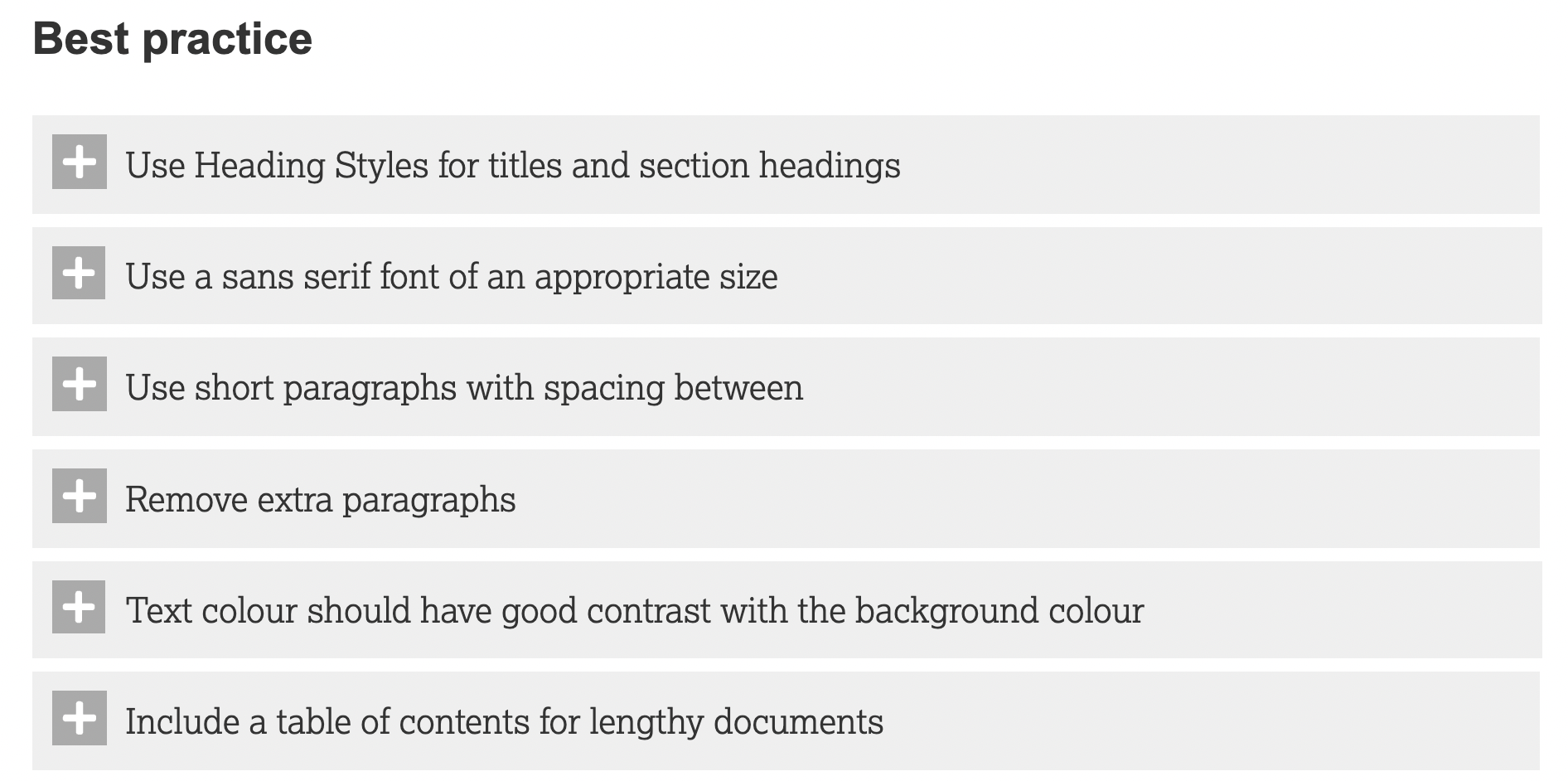
It made sense to begin by seeing what guidance my university had to offer and I found this page that included a checklist for Microsoft Word documents. Fourteen dropdown sections provided a wealth of best practice information including “a sans serif font of an appropriate size.” Well, I had already selected PT Sans (thanks Satchie), the font I have been using in my blog posts of late, but what about the font size 11? Is it too small, should I increase to 12? Would this make the document more accessible? I had no clue so looked at the second dropdown section that advised: “It is recommended that a font size of 12pt or larger is used for the main text.” Okay then, I think it looks too big and haven’t made a decision yet, will save that one for later.

I found the process of going through all of this information incredibly helpful. The content helped me understand what I was doing rather than merely running the Microsoft Word accessibility checker for my manuscript and addressing the results. The current draft of the manuscript looks in good shape from an accessibility perspective (with no errors, and I have checked the reading order of the many tables as suggested in the warnings below!).

I had to locate additional resources to help with Alt text for a process flowchart (straightforward enough since it contained straight lines) and a more complicated concept map with arrows and lines in all directions. Penn State guidance was most helpful. While I gave both of these my best shot I am not yet convinced that they do the job they are intended to do. I also looked at my table of abbreviations with guidance from Cornell University Graduate School. When I set the table to read aloud by Daniel (yep, the reader has a name), he correctly read out the abbreviation for Non-Governmental Organisation as N.G.O. and the World Health Organisation as W.H.O. rather than ‘WHO?’ as examples, but this was not the case for others including Information and Communications Technologies that we refer to as I.C.T.s but Daniel called ‘icts’! As a result, I listened to every abbreviation and made the necessary adjustments where required. Why is this important you may ask? Well, I would like anyone interested in listening to my thesis to have the same experience as anyone reading it. The process has been quite an eye-opener and I’m not there yet. Part 2 will follow with further reflections.
Until next time, Sandra
References:
Ahead. (n.d.). Creating Accessible Documents. Retrieved 29 January 2023 from https://www.ahead.ie/creatingaccessibledocuments

One thought on “Thinking about accessibility: Part 1”