In December 2020, I reached out to an alumna of my programme for some general advice on how best to manage Part 2 of the programme, with the goal of being awarded a PhD for my efforts in 2023. Her generous advice included a tip to make good use of the period between submission and viva examination. Good advice I agree, so my first task is to design a poster that represents my research on a page, not just any research poster, an accessible research poster…
In Ireland, learner drivers progress to novice drivers once they have passed their driving test and display an N-plate on their cars to replace the earlier L-plate. I like to think of myself as a learner in terms of making my writing accessible, but perhaps I have progressed to becoming a novice. Why? Well, the first thing that came to mind when I thought about creating a research poster was what colour palette might be appropriate for an accessible design. The fact that I don’t know the answer to this question suggests that I have some work to do, hence this post alongside my research poster work.
I like using Canva for some of my volunteering communications work. I can easily search for a template for the communication I am planning, customise appropriately, save and download for use. I tend not to give much thought to accessibility but that has all now changed (see Part 1 of this post series). Canva is one option to create my research poster, the other is PowerPoint. I admit that I like Microsoft’s accessibility check feature in Word and since PowerPoint belongs to the same suite I can expect the same feature. However, I want to broaden my experience of incorporating accessibility into my writing so I decided to give Canva a go.
First step involved not looking for a poster template to leverage, rather looking at how Canva manages accessibility. At conferences I have seen posters that are hugely colourful, have lots of text boxes and nice images, all on a single page, usually portrait but sometimes landscape. I wonder now how accessible these posters were, or whether accessibility was a consideration by the author. Off to a good start with Canva’s commitment:
Our Commitment
Source: https://www.canva.com/policies/accessibility/
We believe that everyone should be able to use Canva independently, regardless of their circumstances. That’s why Canva is committed to identifying and removing all usability barriers, while encouraging accessible design from the start.
Be warned, there is a lot of information contained in these pages so I was drawn to a PDF document called Accessibility Conformance Report (ACR) and Voluntary Product Accessibility Template (VPAT). From here, I was able to select sections that I planned on incorporating into my poster design that would of course utilise a Sans Serif font. I already learned how to use alternative text (Alt text) for images and wondered about how these would work in a single page poster. As for colour, well, I would have to see what would be recommended for my purpose.
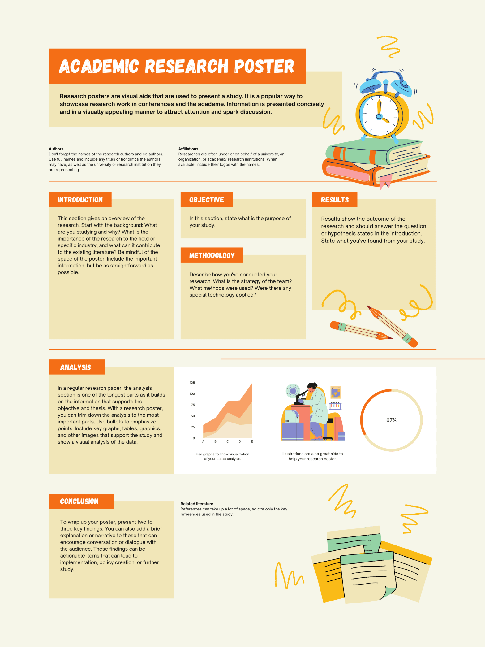
With these three elements in mind (font, images, colour) I searched for a poster template in Canva and landed on one titled ‘Orange and Cream Playful and Illustrative Portrait University Research Poster’. The two default fonts looked appropriate although I had not come across them previously (Gagalin and Open Sauce – what a name!). The default images were clear enough (books and a clock, pencils, notepad pages) and surely easy to add alternative text to if I decided to keep them? What about the colour though? Orange and cream may well be playful colours but are they accessible? Canva provides guidance on ‘use of colour‘ that it ‘supports’ so this is good news. Not the same applies to ‘non-text content‘ that Canva ‘partially supports’. I should therefore minimise use of any images and perhaps retain only the default images mentioned above.
Adding Alt-text to the images was a little tricky and I don’t quite understand what Canva mean by ‘partially supports’. I opted for a workaround text box suggested by FreshSpectrum.com and this seems to work okay until Canva moves from ‘partially supports’ to ‘supports’, hopefully before too long since this is important from an accessibility perspective.
Note: While I did manage to ‘send to back’ the Alt text box for two of the images that were big enough to cover it, for the third, shown here, the Alt text box peeped through. I decided to leave it like this since the important point is that an automated reader should be able to access it.
Canva’s guidance on the use of colour was extensive, particularly in relation to distinguishing content for users:
Guideline 1.4 – Distinguishable
Source: https://www.w3.org/WAI/WCAG21/quickref/?versions=2.0&showtechniques=141#use-of-color
Make it easier for users to see and hear content including separating foreground from background.
It seems that the default orange and cream colour scheme should not cause problems so I plan to leave those for now. More important is the reading order of the text boxes and ensuring that a screen reader can follow the flow. I was unable to find an easy way to check how the poster would be read by a screen reader. No doubt there are solutions that I have not yet found but the option I used was to export the poster into Microsoft Word and use the Read Aloud feature. A different result occurred in that the text only made it to the Word document and the order was not correct for every element. The three alt-text image descriptions appeared at the top of the document, the author details at the end. So, not the best experience but since I’m a novice at this stuff I am certainly learning with every attempt. For me the key is to keep attempting to incorporate accessible features into all my writing.
I admit that I’m not the most creative of beings, and the thought of trying to draft a poster from scratch was quite daunting. Coupled with the ‘wordy’ nature that academic posters and slides tend to be, it was great to be able to use a ready-made template that has resulted in what should be a more accessible poster representing my research than I would have created in the past. Thank you Canva. Now back to work on the poster content.
Until next time, Sandra
Featured image courtesy of canva.com
